Ancestry – Finding my roots

Ten years ago I traveled to a small village named Chiusaforte, in the northeasternmost part of Italy, close to the border with Austria and Slovenia. I spent the best summers of my childhood there, and my father lived there for a while in the 1940s. The reason? My grandfather was born there. And so my great-grandfather, as I discovered.

Luckily, my father’s cousin had some knowledge about our family, and shared with me this interest on our family history. Chiusaforte has been bombarded during the WWII. Furthermore, the whole area has been struck by a devastating earthquake in 1976, so basically all the documents in the municipality got lost in different occasions.

Where could I find more information about my family tree? The answer was: the local church!

Churches, especially in Italy, always had a great importance in running the town’s life, and acted as public record offices that recorded all the births, marriages and deaths that happened. Luckily, the local priest wanted to help us, and gave us the keys to the church’s cellar.

I can’t describe the feeling of touching centuries old books, browsing through thin and dusty pages written by someone back in 1600, like this one:

Book of births and baptisms in year 1643

Connecting the dots

In the cellar we found books up to the XVII century, not to bad for a little village with less than a thousand people! We started looking for our closer ancestors in the XIX century book of births, and easily found my great-great-grandfather.

In small villages it happens that different families share the same surname, so it was common practice to add a soprannome, which is a sort of additional family name. For my family (surname: Marcon), this additional name was Contin, as you can see in the following picture. In the second line, Giacomo Marcon is identified also as “Contin”, and so were his sons and daughter, line 4-14 – yes, he had ten children!

My great-great-grandfather’s page in the parish ledger, ca. XIX century

In only one afternoon, I was able to track my genealogy with proven documentation back to Valentino Marcon, born on Jun 19, 1739 by Giacomo Marcon and Giovanna Fuccaro.

The great emigration to America

Some entries had a date of birth but not the date of death. That made me think that these people probably died somewhere else. In particular I was intrigued by Ariosto Marcon, a first-grade cousin of my grandfather, who in the notes had “in America”, and no date of death.

Ariosto Marcon, born in Chiusaforte, and then emigrated to America

The best part of this story is that I was able to find his record on ellisisland.org and then thanks to other resources (ancestry.com, newspapers.com) track his family history down to our times.

This is a longer and really inspiring story that definitely deserves another post :)

Will these document be lost?

After my brief adventure in search of my family roots, one thought struck me: I was lucky enough to have the chance to dive into these books, but the condition I found them was terrible. Sure, these are books that lived through centuries, but how long will they still keep intact? This is a village in the mountains, often there are heavy rains, humidity and in general in the basement where they are stored there are bad environment conditions.

Here’s how centuries old books were stored in the church’s basement

What a big loss would it be if they would become dust, so many precious information about real people lost, and we had the chance to do something. Sure, it’s a huge work, but already today there’s a big effort in digitalising old books and documents, and I would love to see that happen in my country as well. This is the story of a small village, but the same applies to thousands of other villages, towns and cities all around Italy and the rest of the world.

In the hope that this post could inspire someone, I’ll add a small gallery of the pictures I took that day – the quality is not the best, but we’re talking about 10 years ago.

Inline SVG + HTML tag broken paths

I’m working with SVG lately, in particular with music notation.

In particular, I have an SVG image loaded inline the html page directly in the code (without using an <img> tag).

Until yesterday (15 Mar 2016), the SVG displayed fine in Chrome (version 48):

Correct SVG

Starting from the day after, here’s what I started to see:

Before svg base fix

This has been very hard to debug, because during those two days I didn’t change anything in the code. After some debugging I found what was causing the problem: the <base> tag, and the fact that the browser automatically updated to version 49. Probably Chrome developers changed something that is related to this behavior.

So, how could we sold this problem?

Solution 1

Remove the <base> tag.

Solution 2

Don’t use inline svg, use an <img> tag. E.g.: <img src="myImage.svg">

Notice that this could create some issues if you’re manipulating SVG elements directly (e.g. with jQuery), because the SVG elements won’t be part of your DOM anymore.

Solution 3

Use a javascript fix. Without jQuery:

var baseUrl = window.location.href.replace(window.location.hash, "");
[].slice.call(document.querySelectorAll("use[*|href]"))
  .filter(function(element) {
    return (element.getAttribute("xlink:href").indexOf("#") === 0);
  })
  .forEach(function(element) {
    element.setAttribute("xlink:href", baseUrl + element.getAttribute("xlink:href"));
  });

With jQuery:

if ($("base").length) {
        var Url = window.location.href;
        var hash = window.location.hash;
        var CleanUrl = Url.replace(hash, "");
        var origin = window.location.origin.length + 1;
        var trimmedUrl = CleanUrl.substring(CleanUrl.length, origin);
        $("svg:not(.no-convert) use").each(function(){
            var href = $(this).attr("xlink:href");
            var str = href.split("?");
            str = str[str.length - 1];
            $(this).attr("xlink:href", trimmedUrl  + str);
        });
    }

Both solutions work, but remember to include this code in a callback you can bind to an event (e.g. document loaded, SVG loaded after an ajax call, etc..), or it won’t work as you may expect.

Sources:

Responsive CSS sprites

If you’re reading this, you probably already know what is a sprite. In web development, this technique allows to limit the number of requests to the server by downloading a single image composed by a number of smaller images. To be clear in this article, the sprite will refer to the larger image containing the combination of the smaller images, that will be called tiles.

Then, to show your tile, you just need to create an element (e.g. <i class="image-1">) and use the coordinates of the tile – using the sprite as reference system – as background-position, and the original dimension of the tile as width and height for that class.

This approach works and is widely used today, but the problem is that it’s not responsive. Sprites (and so tiles) generated this way don’t scale on smaller resolutions, nor you can’t simply add a max-width: 100%; as you would do to any <img> element.

In a hurry?

Jump to the demo

Could background-size help?

Background-size is a CSS property that lets you – as you may imagine – set the size of the background image. But everyting will be clearer with an example.

Consider the following image composed by three sprites with the following dimensions:

  • 100×200
  • 150×100
  • 300×300

Sprite

The resulting image will have the maximum width among tiles as width, and the sum of all tiles’ heights as height. In this example, 300×600.

A percent value for this background-size refers to the sprite width. Each tile’s background size in percent has to be calculated with the following formula:

100 * spriteWidth / tilewidth

So, for the three tiles we’ll have: 300%, 200%, 100%. In other words, background-size could be read as a zoom value: to fill a 300px wide space, a tile wide 150px must have a background-size value of 200%.

How does background-position work?

This is quite difficult to grasp at the beginning. Official MDN documentation: “percentages values refer to the size of the background positioning area minus size of background image; size refers to the width for horizontal offsets and to the height for vertical offsets”. What does this mean?

Background-position has two values: x and y. We fix the x to 0 for simplicity. This is why the generated sprite has only one sprite per row, and every tile is aligned to the same value (0) in the x axis.

To calculate the second value, this is the formula:

100 * tileYOffset / abs(tileHeight - spriteHeight)

This is pretty counter-intuitive to me. If you want to deepen your knowledge, this is the best article I found about background-position explanation.

For our example tiles, we have:

  • 100 * 0 / abs(200 – 600) = 0%
  • 100 * 200 / abs(100 – 600) = 40%
  • 100 * 300 / abs(300 – 600) = 100%

This is the basic we need to correctly position and size our tiles. Now let’s make them fully responsive.

Additional CSS

We need to force the tile to have a constant aspect ratio. The width of the tile can be set to the same percent value we calculated for background-size. But we can’t use the height rule for it: its value in percent refers to the height of the container (which is not known). The best way I found to solve this is to set the height to 0, and use padding-bottom. Padding in percent refers to the width of the container, which we explicitly set.

To calculate padding bottom, we just calculate the width / height ratio from the original tile’s width in pixels:

tileHeight / tileWidth * 100

For our three tiles:

  • 200 / 100 * 100 = 200%
  • 100 / 150 * 100 = 66.666666%
  • 300 / 300 * 100 = 100%

This is enough to guarantee that the correct aspect ratio is kept. Now we have fully responsive tiles that resize maintaining the aspect ratio at browser resize. Naturally they all have a max-width: 100% to guarantee responsiveness. The problem is that they fill all the container’s width without stopping to grow, while it’d be nice that their size could be at most the original tile’s one.

This problem could be solved using pseudo-elements, in particular I used ::after. The goal is to have the minimum markup possible and rely mostly on the (generated) css to show the tile from our sprite. By setting some empty content and all the properties we calculated until now to a ::after element for every tile class, we now only need to set a max-width and a max-height to their container (the tile element itself). I guess it’ll be clearer with a full example. Let’s take our second tile:

Markup:

<i class="icon-150x100"></i>

CSS:

.icon-150x100 {
    max-width: 150px;
    max-height: 100px;
}

.icon-150x100::after {
    /* the following rules are inherited by the generic common tile style */
    content: ' ';
    display: inline-block;
    max-width: 100%;
    background-size: 100%;
    background-image: url('sprite.png');

    /* class specific rules */
    background-position: 0 40%;
    background-size: 200% auto;
    height: 0;
    padding-bottom: 66.6667%;
    width: 200%;
}

Here you can find a fully functional proof of concept – a live demo accepting only PNG and a limited number of tiles at the moment.

This approach has been tested on the latest versions of Chrome and Firefox, but it should be fully supported by IE9+ too. Probably also by IE8 just by changing the pseudo elements from ::after to :after.
The next step will be to modify compass or some sprite generator software (such as spritesmith) to generate this responsive sprite code.

This work has been inspired by http://responsive-css.spritegen.com, thanks to his author Greg.

Getting HTTPS on Amazon CDN (without paying for custom domain SSL)

Recently I had to deal with the following problem: supporting HTTPS on a web page stored on Amazon S3, delivered with CloudFront.

Why is this so complex?

Let’s make a step back: SSL certificates basics, from a handshaking point of view. I won’t talk about data encryption here.


What Happens When a Browser Encounters SSL

  1. A browser attempts to connect to a website secured with SSL.
  2. The browser requests that the web server identify itself.
  3. The server sends the browser a copy of its SSL Certificate.
  4. The browser checks whether it trusts the SSL Certificate. In order to do this, browsers include a set of trusted Certificate Authorities (CA) certificates, used to verify the received certificate signature. If so, it sends a message to the server. The certificate received must match whatever domain the user requested.
  5. The server sends back a digitally signed acknowledgement to start an SSL encrypted session.
  6. Encrypted data is shared between the browser and the server and https appears.

An SSL certificate is tied to a domain (or a set of domains, using wildcards); also you cannot have more then one certificate configured per IP address. Since SSL handshake takes action before any HTTP happens, the server cannot send a specific certificate for different domains.

On a single-host server, adding a SSL certificate is a trivial task, involving a certificate generation and a simple web server configuration.
In a cloud network, on the other hand, every endpoint serves different content from several customers. As SSL is designed, is not possible to

This problem is solved with the introduction of Server Name Indication (SNI), an extension to the TLS protocol that is supported by most modern browsers, which allows multiple domains to serve SSL traffic over the same IP address.


Why is SSL on cloud so expensive?

Amazon offers the possibility to serve HTTPS requests through your domain using SSL, but this requires a dedicated IP for your domain on every endpoint in the cloud. The bigger the cloud, the more expensive this will be. Amazon, at the moment, offers this options at the price of 600$/month per domain.

If you don’t need your domain in the base request – in other words, in the browser’s address bar -, you can still use the base certificate offered by CloudFront, which uses the wildcard *.cloudfront.net. You’ll see something like https://dabc123def543.cloudfront.net, along with a valid SSL certificate.

In alternative, Amazon CloudFront can be configured to serve HTTPS requests using SNI without additional charge. It’s easy to understand that this is not a cost for them: there’s no need to get a number of dedicated IPs, but it’s just a simple configuration that is propagated to every endpoint.


So, why SSL is still needed?

Some older browsers don’t support SNI: if you need those browsers to use HTTPS, you still need to provide SSL instead of SNI.


Our solution

A proxy html page has been created with the following javascript code:

(function check_sni() {
var img=document.createElement('img');
img.src='https://my.cloudfront.domain.com/sni-test-pixel.png';
img.onload = function() {
// Execute this block if SNI works.
location.href = "https://my.cloudfront.domain.com/index.html";
}
img.onerror = function() {
// Execute this block if SNI doesn't work.
location.href = "https://d.cloudfront.net/index.html";
}
img.style.display='none';
document.body.appendChild(img);
})();

This is a self executing function that tries to load a 1-pixel image using HTTPS from my.cloudfront.domain.com. This is a CloudFront domain with only SNI enabled.

If browser supports SNI, the image is correctly loaded and the onload event fired. A redirect to the CloudFront SNI enabled domain is performed, anche the user correctly sees that his connection is safely encrypted.

If browser doesn’t support SNI, the onerror event is fired. A redirect to the CloudFront random-genernated third level domain is performed. The users won’t have your domain name on the address bar, but at least the connection will be encrypted.


Sources & further readings:

https://www.ebower.com/wiki/Detecting_SNI_with_Apache

https://sni.velox.ch/

http://www.symantec.com/connect/blogs/how-does-ssl-work-what-ssl-handshake

http://aws.amazon.com/cloudfront/custom-ssl-domains/

ng-if/ng-switch breaks ng-model? No, it’s just a matter of understanding scopes

Lately I’ve been working on an AngularJS project, and I incurred on something that at first I considered a bug. Here’s some example code:

<script src="//ajax.googleapis.com/ajax/libs/angularjs/1.2.19/angular.min.js"></script>
<script>// <![CDATA[
function MyCtrl ($scope){
    $scope.showMySelect = true;
    $scope.opts = [1,2,3];
    $scope.mySelectValue = 2;
}
// ]]></script>
<div><section>{{mySelectValue}}
<select></select></section></div>

I wanted to update $scope.mySelectValue with the selected value in the select. Simple as that. But this code doesn’t work as I expected.

What puzzles at first is that in the controller we set $scope.mySelectValue to 2, and the select actually shows 2 as the selected value. But if we change the value in the select, the model doesn’t update. How come that the model binding isn’t bi-directional as usual?

This behaviour is caused by ng-if: in fact, this angular directive creates a new scope. So, as usual in JavaScript, it’s all a matter of scopes.
When using angular’s 2-way data binding to a primitive (e.g. number, string, boolean), the model won’t update. Here the child scope can read the parent scope, but can’t update it.

Possible solutions:

1) use $parent to refer to the parent’s scope: ng-model=“$parent.mySelectValue"

2) bind to a object instead of a primitive:

Controller:

...
$scope.mySelectValue = { "val" : 2 };
...

View:

...
<select></select>
...

3) (not suggested) use ng-show/ng-hide directives instead of ng-if. This isn’t suggested because it could pollute the scope (and increase memory usage), since the elements are created in every case then just shown or hidden.

Ng-if directive was introduced in angular 1.1.5. This behaviour also exists with ng-switch and ng-repeat directives (already present in older versions)

Further reference

https://github.com/angular/angular.js/wiki/Understanding-Scopes
https://github.com/angular/angular.js/issues/7216#issuecomment-41185572
https://www.youtube.com/watch?v=ZhfUv0spHCY&feature=youtu.be&t=30m
http://jsfiddle.net/r4RKW/1/

F5ers

I believe that access to worldwide information in real-time is a huge thing for the world. Anyway, in my opinion, in some cases it could be detrimental to social relations. Telling something to somebody who doesn’t know it gives us a positive feeling. I beliee it’s the feeling to be useful. Is the same feeling that you perceive when you teach something to a kid. In that case, you “work” on a virgin field, and for a parent is amazing to tell something to his son (or daughter), looking through his big wide eyes which show an alert listening. No matter if the kid will forget that simple thing, in that moment his amazed expression is the best wage for the parent’s effort. This happens in adults too: when I tell something to my girlfriend, or to a friend, something they don’t know, my brain releases some chemical which makes me pleased. this makes me feel somehow important, subconsciously. Try to notice that.

But now there’s something morbid in the way people make use of information. You have to know EVERYTHING, and immediately! You never want to be unprepared, you never want to say something older than a few days. In the best case you receive as answer a “yeah, I already know that”, which in any case destroys the excitement of the original speaker, closing abruptly the dialog. As if being not informed, or didn’t know something before, would be a fault.

This feeling is very uncomfortable for the person trying to start a conversation, maybe telling something fun or interesting read somewhere. Especially for today’s event internet is full of F5ers. This is the name I use to identify people who spend most of their day by refreshing news/reddit/facebook/twitter. After I received a sequence of “old”, “yes, I already saw it”, even for 10 minutes ago news, I decided to take action. I’ll try not to start a conversation starting with the words “did you know that..” or “did you see..”. It’s useless, those people already know. I won’t mind if I’ll lose some occasions to have interesting conversations. The arrogance of those smartasses is too unpleasant. Moreover, I’m certainly not that guy that shares stuff like “did you see the new rat-dog from Zambia on Reddit?”. Usually I try to fill my conversation on more stimulating topics, trying to have an interesting exchange of opinions. With the F5ers this is impossible. No dialogs, useless debates.

I must admin that I have been on the other side as well. Lately it happened to me to already know something, and someone told me “did you see that..”, and I already knew it. At that point I had two choices: answer as a F5er, “yes, already saw that.” and stop the conversation at that point. Or, I could have answered “ah, interesting..” and have a nice small talk about it, and maybe exchange some opinions about it. I chose the second, to try a little experiment and see how the conversation would have proceeded. What I lost? Nothing. For sure my interlocutor didn’t label me as an idiot by not knowing that news. And maybe she felt happy to tell me something new.

A summer weekend project: Battle.net mobile optimizations

I spend quite a bit of time on Battle.net. I have a Nokia Lumia 620 and I noticed the website isn’t optimized for mobile navigation. Don’t get me wrong, it works quite well on IE mobile, but it doesn’t seem to adopt any kind of optimization such as media queries; it’s “just” a regular resized web page that renders nicely.

The first thing that makes it hard to navigate on my mobile is the font size: buttons and links are designed for desktop navigation, and are hard to click on while on my phone; the same applies to text size, which forces me to pinch and zoom in and out to read and navigate through the page.

So I had a look at the html source of the Starcraft II section home page, and I started looking around if –with just a small effort– I could optimize it for mobile devices: it seemed to me that without rewriting the entire page I could have made it render better on my phone with just a few slight changes.

For the impatients:

See the css See the demo (set to 480px)

(to see the demo in all its shining beauty you want to set your browser to a width of 480px)

I want it all! All the puzzles! All the work!

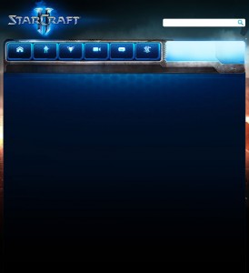
On the left hand side, you can see a screenshot, it shows how the website looks on my mobile after the optimization.

StarCraft II (20130704)

Just the CSS?

The main goal was to use only CSS rules, but I had to introduce a very few lines of HTML to make it work the way I wanted.

This line basically sets the width and initial scale of the page to fit the device width:
<meta name="viewport" content="width=device-width, initial-scale=1.0" />

Additionally, I added a reference to my custom stylesheet, which is where I’m going to store all the CSS rules:

<link rel="stylesheet" type="text/css" media="all" href="sc2/static/css/sc2-responsive.css" />

Finally, I also made some other minor edits to the html, just changing some image paths from absolute to relative to make sure they show the local copy of the images I downloaded.

Back(to the)ground

One of the first things I worked on is the background: I noticed that Battle.net actually does use media queries, but just to set the right background of the page depending on the browser resolution. Available background widths span from 1024 to 1920. My mobile has a resolution of 480×800 (portrait), and that’s the viewport size I’d like to optimize the target page.

So I started studying the 1024-width version of the background image:

body-bg-baked-1024px

(click on the image to enlarge)

Using Photoshop, I tried to see how I could edit it by changing as little as possible, rearranging elements to nicely fit into a 480-width viewport, also improving where possible the usability on a mobile device.

  • First of all, I moved the search bar to a more convenient location;
  • Next, I repositioned the nav menu in two lines instead of one;
  • Another relevant change is the light blue horizontal-striped area on the right hand side, which I shortened to fit. It isn’t just a simple cut, but rather an accurate redraw for an element I considered too big for the mobile visualization.

I also made some other minor changes, such as maintaining a small vertical stripe of the original right background.

The following image shows the result:

body-bg-baked-480px

Let’s dive into the css now.

sc2-responsive.css

At the beginning of the css file I added a @-ms-viewport rule, which is specific for microsoft devices as the one I’m working on:

@-ms-viewport {
    width: device-width;
}

Next, I wrote the basic media query block that will store all the rules specific for a resolution of max 480px:

@media only screen and (max-width: 480px) {
}

The idea is to override all the rules already defined in other css files which are responsible for the layout of the elements we’re going to change somehow. Let’s start with our main canvas:

html {
	max-width: none;
	min-width: 0;
}

body {
	background-image: url("../images/layout/bg/hots/body-bg-baked-480px.jpg");
	background-repeat: no-repeat;
	background-position: 0 0;
	max-width: none;
	min-width: 0;
}

We now need to reposition the search field; I also reduced its size by a few pixels, and removed the float property:

.search-bar {
    left: 90px;
    position: absolute;
    top: 340px;
}

.search-bar .search-field {
    width: 260px;
}

.search-bar .search-button {
    right: 45px;
    top: 3px;
}

.search-bar form {
    float: none;
}

For the nav menu, I opted to put the six boxes in two lines. Since the boxes already have a float:left rule, the easiest way to achieve the desired result was to set a fixed width to the container. I also needed to reposition the background for the three lower boxes:

.head .menu {
	width: 315px;
	height: auto;
}

.head .menu li {
	margin-bottom: 1px;
}

.head .menu li.menu-media a {
	background-position: -315px 0;
}

.head .menu li.menu-forums a {
	background-position: -420px 0;
}

.head .menu li.menu-buy-now a {
	background-position: -525px 0;
}

For the right call to action “Login now” I had to make a decision. There’s not much room for the original text width, so I opted for a hard resize. Also the small logo has been removed.

.character-card a.click-area .inner {
    position: absolute;
    right: -7px;
    top: 18px;
    width: 97px;
    padding: 0;
}

.character-card a.login {
    background: none;
    width: auto;
}

.character-card, .character-card a.click-area {
    width: auto;
}

.character-card .avatar-frame, .character-card .avatar-frame .border {
    display: none;
}

As for the slideshow, I just shrunk it a little bit, reducing its width:

.ui-slideshow {
	width: 453px;
}

.ui-slideshow .slideshow {
	width: 450px;
}

.ui-slideshow .slide {
	width: 450px;
	background-size: 450px auto;
}

Now came the trickiest problem: below the menu, this page is essentially split in two parts, the left one (content) and the right one (sidebar). If I just shrunk the page width, the problem would have been that the right sidebar floated above the left content. This happens because in the html code the right sidebar comes before the left one, so the browser actually renders it correctly.
Unfortunately that’s not what I wanted, because the left content is way more important, and must be positioned above the right sidebar.

Without changing anything in the html, I achieved this result using the display property. The idea is to remove all the float, then assigning the container a display: table rule, then using table-header-group and table-footer-group values to reposition the inner elements. This is not the only choice (you could also use flex, or grid), but certainly display was the most supported by browsers.

.body-bot {
	display: table;
}

.news .right-sidebar {
	display: table-footer-group;
	float: none;
}

What about the content on the left? Another little problem was that I’d have liked to leave the slideshow at its position, just below the nav menu. So I couldn’t assign the table-header-group value just to the left content. I needed to wrap slideshow and left content in a div, then assign the rule to this one. Let’s see the code:

.thg {
	display: table-header-group;
}

#slideshow:before {
	content: "<div class='thg'>";
}

.news .left-content {
	width: auto;
	float: none;
	padding-bottom: 30px;
}

Et voilà, that does the trick! A trick successfully executed after getting help from the fine folks at SO :)

Most of the work is done: I needed now to fix the font and images size for the news. This page has two kinds of news, featured news and blog news. For a better mobile navigation, I opted to enlarge a little bit the featured news (image and font size), showing one per line. I know the image is shrunk and looks a little blurred/pixelated, but this is just a demo, I don’t have access to the original image :)

For the blog news section I set the image width to nicely fit the block width, and positioned the news text below the image. I also increased the font size to improve readability. Furthermore, I added a background to this section, reusing the featured news background and obtaining a nice result.

The code for the news sections is pretty straightforward, so I didn’t include it in this article.

Last but not least, the footer. In mobile optimized websites, usually the footer section is rendered as a list, which is probably the most comfortable way to improve usability by avoiding misclicks to the user.

The font size has been increased, the columns icons repositioned; the text-alignment has been set to center.

#sitemap.promotions .column {
	width: auto;
	float: none;
	font-size: 16px;
}

#sitemap .column {
	padding-left: 6px;
	text-align: center;
}

#footer #sitemap h3.bnet {
	background-position: 0 5px;
}

#footer #sitemap h3.games {
	background-position: 2px -45px;
}

#footer #sitemap h3.account {
	background-position: 2px -145px;
}

#footer #sitemap h3.support {
	background-position: 0 -195px;
}

#footer h3, #footer h3 a, #copyright a {
	font-size: 19px;
	float: none;
}

What about other browsers?

I mostly tested this work on my Lumia, but when I took a look on Android or iOS devices, I noticed some elements of the page were disaligned. Then I made some slight changes (e.g. setting a fixed width to the main wrapper) in order to render it correctly.

Final thoughts

Is this the perfect solution? Is this the best mobile layout? Nope. I worked a couple of nights on this, and I’m pretty satisfied on the result. But still, this is just a demo, a feasibility study. There’s a lot more I’d love to improve, but I stopped here because I don’t have access to the original battle.net code. For example I almost left unchanged the top bar, which should also be refined for mobile navigation.

So don’t think this is a final design, there’s a lot of work to do, because it’s just some geek’s weekend project :)