A summer weekend project: Battle.net mobile optimizations
I spend quite a bit of time on Battle.net. I have a Nokia Lumia 620 and I noticed the website isn’t optimized for mobile navigation. Don’t get me wrong, it works quite well on IE mobile, but it doesn’t seem to adopt any kind of optimization such as media queries; it’s “just” a regular resized web page that renders nicely.
The first thing that makes it hard to navigate on my mobile is the font size: buttons and links are designed for desktop navigation, and are hard to click on while on my phone; the same applies to text size, which forces me to pinch and zoom in and out to read and navigate through the page.
So I had a look at the html source of the Starcraft II section home page, and I started looking around if –with just a small effort– I could optimize it for mobile devices: it seemed to me that without rewriting the entire page I could have made it render better on my phone with just a few slight changes.
For the impatients:
See the css See the demo (set to 480px)
I want it all! All the puzzles! All the work!
On the left hand side, you can see a screenshot, it shows how the website looks on my mobile after the optimization.
Just the CSS?
The main goal was to use only CSS rules, but I had to introduce a very few lines of HTML to make it work the way I wanted.
This line basically sets the width and initial scale of the page to fit the device width:
<meta name="viewport" content="width=device-width, initial-scale=1.0" />
Additionally, I added a reference to my custom stylesheet, which is where I’m going to store all the CSS rules:
<link rel="stylesheet" type="text/css" media="all" href="sc2/static/css/sc2-responsive.css" />
Finally, I also made some other minor edits to the html, just changing some image paths from absolute to relative to make sure they show the local copy of the images I downloaded.
Back(to the)ground
One of the first things I worked on is the background: I noticed that Battle.net actually does use media queries, but just to set the right background of the page depending on the browser resolution. Available background widths span from 1024 to 1920. My mobile has a resolution of 480×800 (portrait), and that’s the viewport size I’d like to optimize the target page.
So I started studying the 1024-width version of the background image:
(click on the image to enlarge)
Using Photoshop, I tried to see how I could edit it by changing as little as possible, rearranging elements to nicely fit into a 480-width viewport, also improving where possible the usability on a mobile device.
- First of all, I moved the search bar to a more convenient location;
- Next, I repositioned the nav menu in two lines instead of one;
- Another relevant change is the light blue horizontal-striped area on the right hand side, which I shortened to fit. It isn’t just a simple cut, but rather an accurate redraw for an element I considered too big for the mobile visualization.
I also made some other minor changes, such as maintaining a small vertical stripe of the original right background.
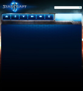
The following image shows the result:
Let’s dive into the css now.
sc2-responsive.css
At the beginning of the css file I added a @-ms-viewport rule, which is specific for microsoft devices as the one I’m working on:
@-ms-viewport {
    width: device-width;
}
Next, I wrote the basic media query block that will store all the rules specific for a resolution of max 480px:
@media only screen and (max-width: 480px) {
}
The idea is to override all the rules already defined in other css files which are responsible for the layout of the elements we’re going to change somehow. Let’s start with our main canvas:
html {
	max-width: none;
	min-width: 0;
}

body {
	background-image: url("../images/layout/bg/hots/body-bg-baked-480px.jpg");
	background-repeat: no-repeat;
	background-position: 0 0;
	max-width: none;
	min-width: 0;
}
We now need to reposition the search field; I also reduced its size by a few pixels, and removed the float property:
.search-bar {
    left: 90px;
    position: absolute;
    top: 340px;
}

.search-bar .search-field {
    width: 260px;
}

.search-bar .search-button {
    right: 45px;
    top: 3px;
}

.search-bar form {
    float: none;
}
For the nav menu, I opted to put the six boxes in two lines. Since the boxes already have a float:left rule, the easiest way to achieve the desired result was to set a fixed width to the container. I also needed to reposition the background for the three lower boxes:
.head .menu {
	width: 315px;
	height: auto;
}

.head .menu li {
	margin-bottom: 1px;
}

.head .menu li.menu-media a {
	background-position: -315px 0;
}

.head .menu li.menu-forums a {
	background-position: -420px 0;
}

.head .menu li.menu-buy-now a {
	background-position: -525px 0;
}
For the right call to action “Login now” I had to make a decision. There’s not much room for the original text width, so I opted for a hard resize. Also the small logo has been removed.
.character-card a.click-area .inner {
    position: absolute;
    right: -7px;
    top: 18px;
    width: 97px;
    padding: 0;
}

.character-card a.login {
    background: none;
    width: auto;
}

.character-card, .character-card a.click-area {
    width: auto;
}

.character-card .avatar-frame, .character-card .avatar-frame .border {
    display: none;
}
As for the slideshow, I just shrunk it a little bit, reducing its width:
.ui-slideshow {
	width: 453px;
}

.ui-slideshow .slideshow {
	width: 450px;
}

.ui-slideshow .slide {
	width: 450px;
	background-size: 450px auto;
}
Now came the trickiest problem: below the menu, this page is essentially split in two parts, the left one (content) and the right one (sidebar). If I just shrunk the page width, the problem would have been that the right sidebar floated above the left content. This happens because in the html code the right sidebar comes before the left one, so the browser actually renders it correctly.
Unfortunately that’s not what I wanted, because the left content is way more important, and must be positioned above the right sidebar.
Without changing anything in the html, I achieved this result using the display property. The idea is to remove all the float, then assigning the container a display: table rule, then using table-header-group and table-footer-group values to reposition the inner elements. This is not the only choice (you could also use flex, or grid), but certainly display was the most supported by browsers.
.body-bot {
	display: table;
}

.news .right-sidebar {
	display: table-footer-group;
	float: none;
}
What about the content on the left? Another little problem was that I’d have liked to leave the slideshow at its position, just below the nav menu. So I couldn’t assign the table-header-group value just to the left content. I needed to wrap slideshow and left content in a div, then assign the rule to this one. Let’s see the code:
.thg {
	display: table-header-group;
}

#slideshow:before {
	content: "<div class='thg'>";
}

.news .left-content {
	width: auto;
	float: none;
	padding-bottom: 30px;
}
Et voilà, that does the trick! A trick successfully executed after getting help from the fine folks at SO :)
Most of the work is done: I needed now to fix the font and images size for the news. This page has two kinds of news, featured news and blog news. For a better mobile navigation, I opted to enlarge a little bit the featured news (image and font size), showing one per line. I know the image is shrunk and looks a little blurred/pixelated, but this is just a demo, I don’t have access to the original image :)
For the blog news section I set the image width to nicely fit the block width, and positioned the news text below the image. I also increased the font size to improve readability. Furthermore, I added a background to this section, reusing the featured news background and obtaining a nice result.
The code for the news sections is pretty straightforward, so I didn’t include it in this article.
Last but not least, the footer. In mobile optimized websites, usually the footer section is rendered as a list, which is probably the most comfortable way to improve usability by avoiding misclicks to the user.
The font size has been increased, the columns icons repositioned; the text-alignment has been set to center.
#sitemap.promotions .column {
	width: auto;
	float: none;
	font-size: 16px;
}

#sitemap .column {
	padding-left: 6px;
	text-align: center;
}

#footer #sitemap h3.bnet {
	background-position: 0 5px;
}

#footer #sitemap h3.games {
	background-position: 2px -45px;
}

#footer #sitemap h3.account {
	background-position: 2px -145px;
}

#footer #sitemap h3.support {
	background-position: 0 -195px;
}

#footer h3, #footer h3 a, #copyright a {
	font-size: 19px;
	float: none;
}
What about other browsers?
I mostly tested this work on my Lumia, but when I took a look on Android or iOS devices, I noticed some elements of the page were disaligned. Then I made some slight changes (e.g. setting a fixed width to the main wrapper) in order to render it correctly.
Final thoughts
Is this the perfect solution? Is this the best mobile layout? Nope. I worked a couple of nights on this, and I’m pretty satisfied on the result. But still, this is just a demo, a feasibility study. There’s a lot more I’d love to improve, but I stopped here because I don’t have access to the original battle.net code. For example I almost left unchanged the top bar, which should also be refined for mobile navigation.
So don’t think this is a final design, there’s a lot of work to do, because it’s just some geek’s weekend project :)


